So as some of you have noticed we’ve had a few new pics from Marvel Studios and Sony Pictures and their upcoming projects. I promised I would break down each character and I will. Lets star with the God of Thunder.

THOR
This one there isn’t much to say. We’ve gotten a pretty good look so far into the movie and what direction the productions design has gone in. While I would have liked something a little more old world and barbaric (we are talking about the Gods of Vikings here), I have to say that they have taken an approach similar to the more recent character design of Thor since the title’s relaunch and I quite like it. Its slick and regal like the son of a king would be, but still has the mail and bulk of a warrior. And it unmistakably looks like Thor. It feels likes its leapt right off the page. Mjolnir looks just as heavy and powerful as it should. And the Halls of Asgard looks just as heavenly and regal as you would expect.

CAPTAIN AMERICA
This is one I’ve been waiting a long time for. I love Captain America. He’s my Superman without all the ridiculous power. He is a heroic idealism personified in a human being and represents the very best of humanity. I’ve never been a fan of the casting of Chris Evans as Captain America, he’s always been a very funny actor and though he can do drama, he never, ever struck me as someone who could play the very serious and very devoted Steve Rogers. He also never looked the part so I am dismayed by pics like this when he looks like a kid wearing his dad’s clothes. Cap is the peak of human fitness, strong, fast and agile. Chris while tall and buff always struck me as much too scrawny for the part. Even after having beefed up considerably he still feels too small.
The Costume is something that I’ve been concerned about from the start. Unlike Wolverine or many other characters there isn’t much you can do with Cap’s costume. You can’t just put him in black leather and call him Captain America. His suit is part of the character, the man draped in the flag of his nation a walking symbol of liberty. He is iconic, and needs to remain iconic as that’s the point of the character both in and out of the comic. He was a rallying point for his fellow soldiers, to remind them what they were fighting for, to be a symbol and motivator in the bleakest of conditions. So you can’t mess with the costume too much and get away with it. I understand that liberties will always be taken as what works on the page doesn’t always translate well. Comic artists aren’t necessarily thinking about practicality when they design costumes for their characters and often it just doesn’t translate well without creative license.
 When the concept art was released months ago for the character I was intrigued. Its was a different approach to the comic character but it worked…on the page. Here I am not so convinced. Its a very busy costume, with straps and belts going every which way. There appears to be little armor or purpose to the design, it looks cumbersome and bulky and lacking practicality that a soldier of war would require. The Iconic look remains but it doesn’t look as finessed as the concept art made it seem.
I like the gloves, the helmet, the belt and holster. It reminds me of Ultimate Captain America’s costume. But I am still not sold on the torso. And the shield. I love the shield! Its beautiful.
Cap aside I am concerned about the design of the Hydra agents behind him. Their equipment feels much too modern. Offset against the vintage truck behind them they feel like as anachronism. They are much too machined and perfect. While steampunk would have been a little too old something in that direction would have been appropriate. Advanced technology that looks age appropriate. I suppose that’s difficult to communicate but I’ve seen it done before and I know its possible.
However, this is all just a first impression. Its but one still image, months away from the film’s release. I will need to see all this in action, see the performance and the movement before I can render and actual judgement. I know I’ve seen other costumes before and thought they were ridiculous until I saw the movie, so I may very well be eating my own words in a few months time. We’ll see…
.jpg)
SPIDER-MAN
There isn’t much known about the new Spider-Man project. Its difficult to get confirmation about much of anything. Sure lots of people state that they have official word but few cite sources and are frequently debunked. We don’t even have a title yet. So I’ve been cautiously optimistic as there is much potential in a new project to do things right, but it could so easily go wrong, and without any official word or tidbits about the story or design, its difficult to judge whether this will be a decent outting for my favorite superhero or another mess. He’s been unfortunate in the last decade with a slew of mediocre movies that were heavily miscast to a couple of failed animated series that never caught on. I still maintain that if they gave Spectacular Spider-Man its due time it would surpass Batman as the best animated series on many people’s lists.
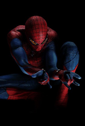
So for all the doubt it was encouraging yesterday to finally see Andrew Garfield in costume.
First I want to say, on the whole I like it. However, there are elements I am certainly not fond of. For one the rubber latex look is terrible. I hope its just the picture, but the costume feels like it was peeled off an old highschool gym class basketball. Its much to rubbery. People have complained about the textured look but I think its necessary design to keep it from looking like a giant condom. Then there is the webbing pattern. I fully admit that I didn’t like Raimi’s raised webbing look of the previous series, but it quickly grew on me. Here its much more muted and understated and I wonder if it will get lost in the photography. I can’t say I am a big fan of the way it fades down his torso and nearly disappears. The chest spider is interesting. It may be something that grows on me but it feels a little too much like a graphic artist trying to hard to do something different for the sake of doing something different. Then there’s the gloves. Again the redesign seems unnecessary, an additional flourish for no real reason, but its something I can live with. All that bothers me is that they seem to be tweaking for no reason other than to make it look cool, which, again, is unnecessary. As a friend of mine pointed out, if it ain’t broke then don’t fix it.
However, those are all cosmetic complaints. The real issue is practicality. Much like Cap this is something I will need to see in motion to really get a sense of whether it was a good idea, but frankly I am concerned that the rubber latex design might be a little too cumbersome. I am not sure Garfield can get a full range of motion in that, and lets face it, Spidey is meant to be a really active character whose physicality defies the usual human limits. He needs to be flexible and agile. Instead he looks like he would strain him self lifting his arms up to shoot a web.
And where are the seams? I get that they are trying to go for a one piece suit look, but it shouldn’t be one piece. We are talking about a teenaged superhero who has to change in allies behind the school or in midtown. He wears this under his clothes and slips on the mask, boots and gloves when he jumps into action. With a one piece outfit he’s going to have to slip it on like a wetsuit each time he needs to change which is not only cumbersome, but takes time. There should be a break down of his costume that is readily apparent. This is of course all speculation, I could be entirely wrong. But I like to see some thought put into the design, some research into the character that is evident when I see the costume. I can’t see much of that.
However, there is one thing that brings me hope that we are heading in the right direction. Its difficult to see but if you blow up the hi-res version of the image and look at his wrists you can see the unmistakable glint of metal. That’s right. Mechanical webshooters. No more organic ones. As much as I liked Raimi’s approach that a highschooler couldn’t design such a complex device for use, that was all negated when we were supposed to accept that a highschooler could design such a complex costume on such a small budget. I am glad to see that Webb and Co have taken a more classic approach to the character which is promising

Design aside, I think Garfield looks terrific. His mop-top hair and scrawny look, with a bag slung over his shoulder, reminds me very much of Ultimate Spider-Man, which is the most encouraging aspect of all. Last week’s spy pics were equally promising. I am a big fan of Garfield’s jacket and hoody look, again very reminiscent of Ultimate Peter Parker’s design, one that I am a big fan of. And then there is Gwen.
Gwen has forever been a favorite character of mine. She is beautiful, intelligent, independent and capable of taking care of herself. She isn’t the usual damsel-in-distress girlfriend that has become such a tired trope for the Superheroes. She is someone who can challenge Peter emotionally and intellectually. And she was one of the few things about Spider-Man 3 I really enjoyed. But there wasn’t enough of her. We barely saw her relationship with her father, which is an integral part of her character, or her annoyance with Parker’s unreliability. So its encouraging to see her in these spy-pics in all her classic glory. The coat, the skirt, the boots, the scarf are all classic gwen. The only thing that’s missing is the trademark headband, which I can’t fathom why that’s been missing so far. That aside, the small glimpse we have had inside the new Spider-Man production have been encouraging and I look forward to much more.
Now…tell me who the hell is playing Jameson!


